Script para Python 3.10 que genera un gráfico 2D de datos con tres variables: x, y, z, esta última en código de color.
import pandas as pd
import seaborn as sns
import numpy as np
import matplotlib.pyplot as plt
from matplotlib.colors import ListedColormap
from matplotlib.ticker import StrMethodFormatter
from matplotlib.ticker import AutoMinorLocator
# MUY IMPORTANTE: ejecutar con el Kernel de Python 3.8.16
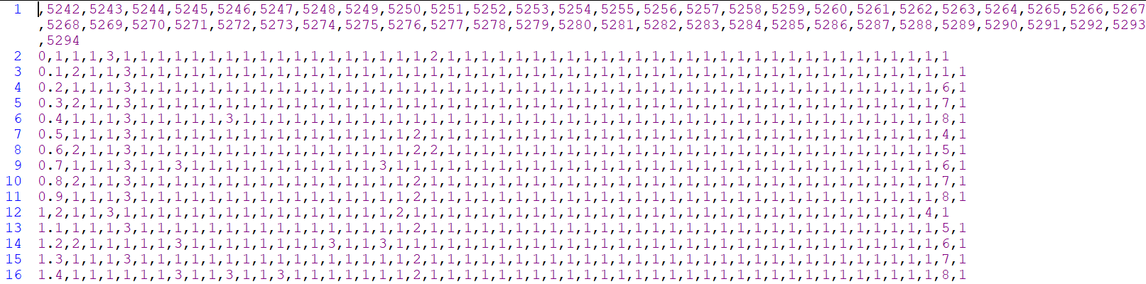
# Cargar los datos desde el archivo CSV y transponerlos. CVS con datos separados por ","
datos = pd.read_csv('P10_M6.csv', header=0, index_col=0).T
#datos = pd.read_csv('4y2b.csv',delimiter=';',header=None,dtype=int)
# Crear un mapa de colores personalizado
# 1:'white',2:'red',3:'green',4:'yellow',5:'blue',6:'magenta',7:'cyan',8:'gray'
# 1:'white',2:'HB',3:'Hyd',4:'Hyd+HB',5:'Ion',6:'Ion+HB',7:'Ion+Hyd',8:'Ion+Hyd+HB'
#colores = ["#FFFFFF", "#FF0000", "#00FF00", "#FFFF00", "#0000FF", "#FF00FF", "#00FFFF", "#808080"]
colores = ["white", "red", "green", "yellow", "blue", "magenta", "cyan", "gray"]
valores_enteros = list(range(1, len(colores) + 1))
valores_a_colores = dict(zip(valores_enteros, colores))
cmap = ListedColormap([valores_a_colores[i] for i in range(datos.values.min(), datos.values.max() + 1)])
# Crear un mapa de calor con los datos y el mapa de colores personalizado
ticklabels = ['no interaction', 'HB', 'Hyd', 'Hyd+HB', 'Ion', 'Ion+HB', 'Ion+Hyd', 'Ion+Hyd+HB']
ax = sns.heatmap(datos, cmap=cmap, cbar_kws={'ticks': valores_enteros, 'location': 'right', 'pad': 0.04})
# Añadir borde negro a la barra de colores
cbar = ax.collections[0].colorbar
cbar.outline.set_edgecolor('black')
cbar.outline.set_linewidth(1)
# Cambiar los números por los nombres de colores
cbar.set_ticks(np.arange(len(valores_enteros))+0.5)
cbar.set_ticklabels(ticklabels)
cbar.ax.set_yticklabels(ticklabels, ha='left', va='center')
# Pintar las líneas de los ejes X e Y
plt.axhline(0, color='black', linewidth=1)
plt.axvline(0, color='black', linewidth=1)
plt.axhline(len(datos), color='black', linewidth=2)
plt.axvline(len(datos.columns), color='black', linewidth=2)
# Establecer la precisión decimal de los valores en el eje X
plt.gca().xaxis.set_major_formatter(StrMethodFormatter('{x:.1f}'))
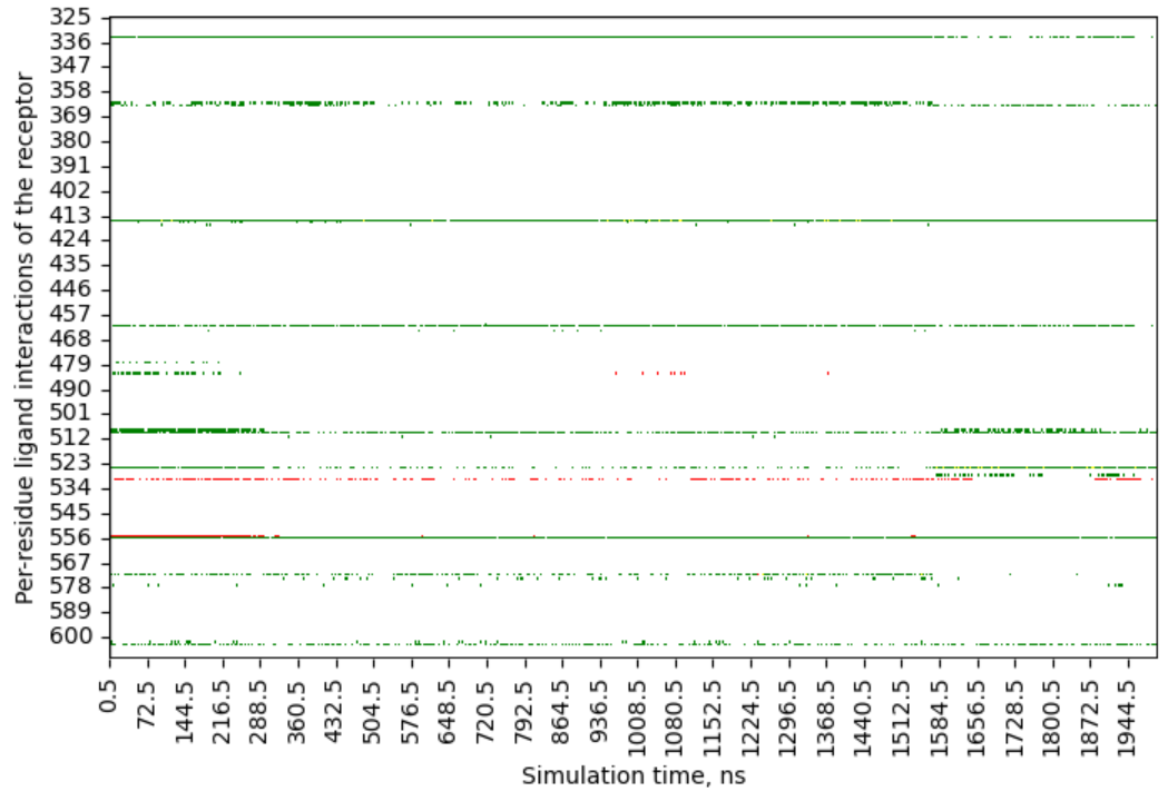
# Agregar etiquetas a los ejes X e Y. Cambia la etiqueta dependiendo
# de si analizas el receptor o el ligando.
plt.xlabel("Simulation time, ns")
plt.ylabel("Per-residue ligand interactions of the receptor")
# plt.ylabel("Per-atom receptor interactions of the ligand")
# Cambiar el tamaño del gráfico
plt.gcf().set_size_inches(10, 5)
# Crear una figura con el gráfico
plt.savefig('P10_M6.png', format='png', dpi=450)
plt.show()
datos = pd.read_csv('P10_M6.csv', header=0, index_col=0).T
def show_y_values_greater_than_one(data):
y_labels = data.index.tolist()
y_values_greater_than_one = {}
for label in y_labels:
count = (data.loc[label] > 1).sum()
if count > 0:
y_values_greater_than_one[label] = count
print("'Number of ligand atom or receptor residue interacting with the receptor")
print("or ligand, respectively.': number")
print("of times that a interaction is repeated:")
print(y_values_greater_than_one)
show_y_values_greater_than_one(datos)
plt.show()
print()
datos = pd.read_csv('P10_M6.csv', header=0, index_col=0).T
def show_y_values_greater_than_one(data):
y_labels = data.index.tolist()
y_values_greater_than_one = {}
for label in y_labels:
count = (data.loc[label] > 1).sum()
if count > 0:
percentage = round(count / len(data.loc[label]) * 100, 2)
y_values_greater_than_one[label] = percentage
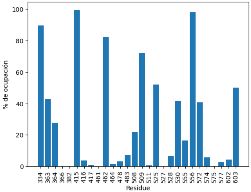
print("Porcentage of occupancy for each atom or residue:")
print(y_values_greater_than_one)
return y_values_greater_than_one
porcentajes = show_y_values_greater_than_one(datos)
plt.bar(porcentajes.keys(), porcentajes.values())
plt.xlabel('Residue')
plt.ylabel('% of occupancy')
plt.xticks(rotation=90)
plt.show()
import pandas as pd
import matplotlib.pyplot as plt
def show_y_values_greater_than_one(data):
y_labels = data.index.tolist()
y_values_greater_than_one = {}
for label in y_labels:
count = (data.loc[label] > 1).sum()
if count > 0:
percentage = round(count / len(data.loc[label]) * 100, 2)
y_values_greater_than_one[label] = percentage
print("Porcentaje de ocupación para cada átomo o residuo:")
print(y_values_greater_than_one)
return y_values_greater_than_one
datos = pd.read_csv('P10_M6.csv', header=0, index_col=0).T
porcentajes = show_y_values_greater_than_one(datos)
# Guardar los datos en un archivo de texto separados por tabuladores
with open('P10_M6.txt', 'w') as file:
file.write("Residue\t% of occupancy\n")
for residue, occupancy in porcentajes.items():
file.write(f"{residue}\t{occupancy}\n")
plt.bar(porcentajes.keys(), porcentajes.values())
plt.xlabel('Residue')
plt.ylabel('% de ocupación')
plt.xticks(rotation=90)
plt.show()Mira justo debajo la matriz de datos del fichero glue-like-23-atoms.csv